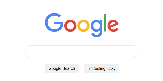
Clone the most popular search engine in the world, Google
We cover
CSS Selectors
CSS targets an HTML element (the selector), then applies property: value pairs inside curly braces.
body {
  color: red;
}
Selector →
body| Property →color| Value →red
Inline vs Block Elements
| Type | Behaviour | Examples |
|---|---|---|
| Block | Stacks on its own line, takes full width | <div>, <p>, <h1> |
| Inline | Stays on the same line as surrounding content | <span>, <a>, <img> |
You can override the default with CSS:
/* Make a span behave like a block */
span { display: block; }

/* Make a div stay inline */
div  { display: inline; }
The Box Model
Every element is a box made of four layers (inside → out):
┌──────────────────────────┐
│         Margin           │
│  ┌────────────────────┐  │
│  │      Border        │  │
│  │  ┌──────────────┐  │  │
│  │  │   Padding    │  │  │
│  │  │  ┌────────┐  │  │  │
│  │  │  │Content │  │  │  │
│  │  │  └────────┘  │  │  │
│  │  └──────────────┘  │  │
│  └────────────────────┘  │
└──────────────────────────┘
Margin
Margin adds space outside the element.
/* All four sides */
p { margin: 16px; }

/* Individual sides */
p { margin-top: 16px; }
Most browsers add margin: 8px to the element by default.
Collapsing Margins
When two vertical margins meet, only the larger of the two is used, they don't add together. This applies to vertical margins between block elements
/* These two elements touch — gap will be 24px, not 16px + 24px */
.box-a { margin-bottom: 16px; }
.box-b { margin-top: 24px; }
Centering with Margin
Set margin: 0 auto on a block element with a defined width to centre it horizontally.
.container {
  width: 600px;
  margin: 0 auto;
}
Works for block-level elements with a non-100% width.
Wrapping Elements in a Container
Group related elements inside a <div> so you can style or position them together.
<div class="search-bar">
  <input type="text" placeholder="Search Google" />
  <button>Search</button>
</div>
.search-bar {
  width: 600px;
  margin: 0 auto;
}
CSS Classes
A class lets you apply the same styles to multiple elements.
<p class="highlight">First paragraph</p>
<p class="highlight">Second paragraph</p>
.highlight {
  color: blue;
  font-weight: bold;
}
Prefix class selectors with
.in CSS.
Padding
Padding adds space inside the element, between the content and the border.
/* All four sides at once */
.btn { padding: 20px; }

/* Equivalent longhand */
.btn {
  padding-top: 20px;
  padding-right: 20px;
  padding-bottom: 20px;
  padding-left: 20px;
}

/* Shorthand: vertical | horizontal */
.btn { padding: 10px 20px; }
Border
Border wraps around the padding. The most common style is solid.
.card {
  border: 8px solid blue;
}

/* Fully round (circle) */
.avatar {
  border-radius: 100px;
}

/* Softly rounded corners */
.btn {
  border-radius: 50px;
}
Line Height
Use line-height instead of height when sizing text-based elements — browsers handle it more consistently.
/* Sets the vertical space for each line of text */
.search-input {
  line-height: 44px;
}
Flexbox
Flexbox makes it easy to align and distribute child elements inside a container.
.nav {
  display: flex;
  justify-content: space-between; /* spread items across main axis */
  align-items: center;            /* centre items on cross axis */
  gap: 16px;                      /* space between items */
}
<nav class="nav">
  <a href="#">About</a>
  <a href="#">Store</a>
  <a href="#">Gmail</a>
</nav>
These techniques combined produce the finished mock Google page.